Learning Center – PMS Colors
 Remember back in Kindergarten when you were learning your colors? Red, orange, yellow, green, blue, and purple? Things were pretty simple back then, not going to lie. I sometimes miss the days when my most arduous task was eating my vegetables, which I admit I sometimes still have trouble with. (I like broccoli as much as the next guy, I’m just saying it tastes better lathered in cheese!) Back to colors though, those six main ones I mentioned before, your primary and secondary colors, those were it! Our whole little world of color! But in truth, like all things, it’s never that simple.
Welcome to the world of PMS colors!
Pantone itself actually began as a commercial printing company in the 1950’s. In 1956, employee Lawrence Herbert systematized and simplified their pigment stock and inks. Herbert later purchased the company’s tech assets, renaming it “Pantone” as it is still known today (Pantone Matching System).1
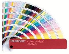
These things actually have their own little “booklet” if you will. My own consists of about 189 pages, each with seven variations of color per page and any grouping of 5-10 pages have various shades of what anyone might at first glance call “red” or “green” or “blue.” Would they be wrong? No, not really. I’ll revisit my colleague Kila’s sentiment a few blogs ago at Shakespeare’s quote: “A rose by any other name would smell as sweet” – red is still red, and a rose is a rose in the eyes of the beholder – unless the beholder is a designer/printer (or in the rose’s case, a botanist).
So why are these so important? Why not just say dark red, or light red? Why make it so complicated? Well for starters, remember what I said in the first paragraph? It’s NEVER that easy. Let’s just set that as a rule of thumb right now.
Ever been in a debate with someone about a particular shade of color? Or gone shopping for that one picky someone who loves the color “lavender,” but upon seeing that sweater they say, “That’s more of a mauve.” I swear I’ve met people who seem to only be able to see in 16-bit color. Believe it or not, this happens on professional levels too. Sometimes you can’t help but go back and forth with people on color choices because one person’s idea of “wine red” isn’t the same as yours. This is where PMS color books become very handy. The PMS colors allow designers, printers, etc. to exactly color match digital files with customers without any concern for discrepancy because it uses Herbert’s predetermined published color formulas to create standardized inks. This lovely system is how companies like Coca Cola can ensure they have the same color of red every single time (PMS 75-1) no matter what printer they go with.
Granted, the use of PMS colors isn’t always necessary, but some examples below may help put into perspective why this system is so helpful.
– Consistent branding for logos (McDonald’s red & UPS brown for example) ensures color accuracy for your brand image.
– Finding colors outside of the CMYK range.
– Smooth coverage of large areas (PMS colors work well when the consistency and saturation of larger areas of solid ink is important.)
 It’s important to understand however that PMS, CMYK, and RGB are not the same things, so a number reference for one will not tie in with another. CMYK is a four color process that consists primarily of the use of Cyan, Magenta, Yellow and Black. RBG is used for on-screen images and is made up of Red, Green, and Blue. Speaking of screens, another reason PMS is so important in the digital age is because of monitor settings. What appears as navy blue on your monitor may not appear so after printed on paper, which can be very frustrating. It’s always good to have one of those PMS booklets handy for this reason alone.
For the sake of time and sanity I will end this blog here. If you’re interested in learning more about PMS colors you can visit the Pantone website or visit any of the links in the reference section below. If you want a quick peek at the overall scope of the PMS color chart, click here.
___________
“Pantone.” Wikipedia. Wikimedia Foundation, 23 June 2014. Web. 25 June 2014. <http://en.wikipedia.org/wiki/Pantone>.
“Design The Planet.” Why use PMS Colors? -. N.p., n.d. Web. 25 June 2014. <http://www.designtheplanet.com/why-use-pms-colors/>.
“Creative MediaWorks.” Creative Mediaworks. N.p., n.d. Web. 25 June 2014. <http://www.creativemediaworks.com/White-Papers/?id=1>.


